ABOUT THE PROJECT
I did my graduate internship at IKNL (Integraal Kankercentrum Nederland). IKNL's main activity is to register all Dutch cancer patients in the NKR (Dutch cancer register). Datamanagers in hospitals all over the Netherlands are responsible for this task and to conduct it, they use an application called RANK.
However, IKNL has received several complaints about RANK. The biggest complaint the datamanagers had was that RANK was very slow and inefficient to work with. Therefore IKNL wanted to research whether a novel interaction design concept could help solve for the complaints of the datamanager and thereby improve the overall user experience
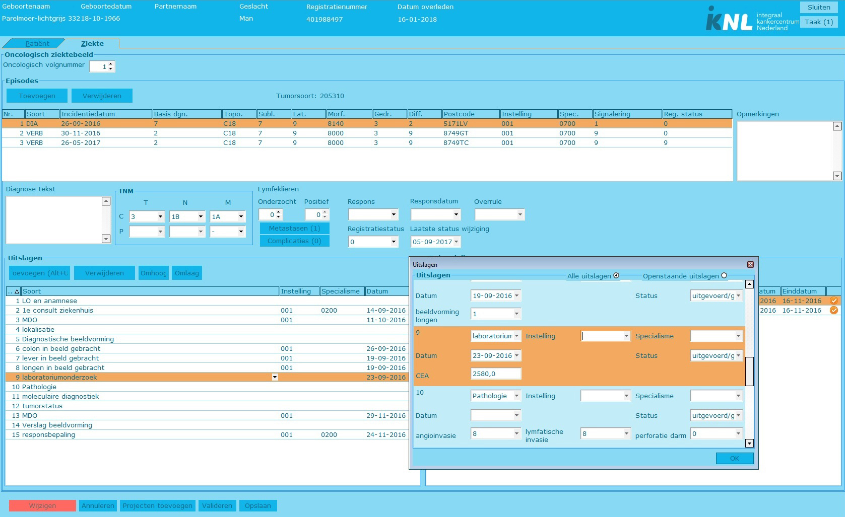
I conducted user observations to pinpoint frustrations the datamanagers had and analised the user task flow. After several usertests the datamanagers were very pleased with the improvements I suggested. In order to measure the usability of RANK as perceived by the datamanagers, I used the System Usabiltity Scale (SUS). The datamanagers scored the old version of RANK a 6 out of 10 according to the SUS. The usability of the new version was graded an 8 out of 10, which shows a major improvement in usability. The end result showed a more efficient and user friendly RANK.
The old version of RANK
Task analysis
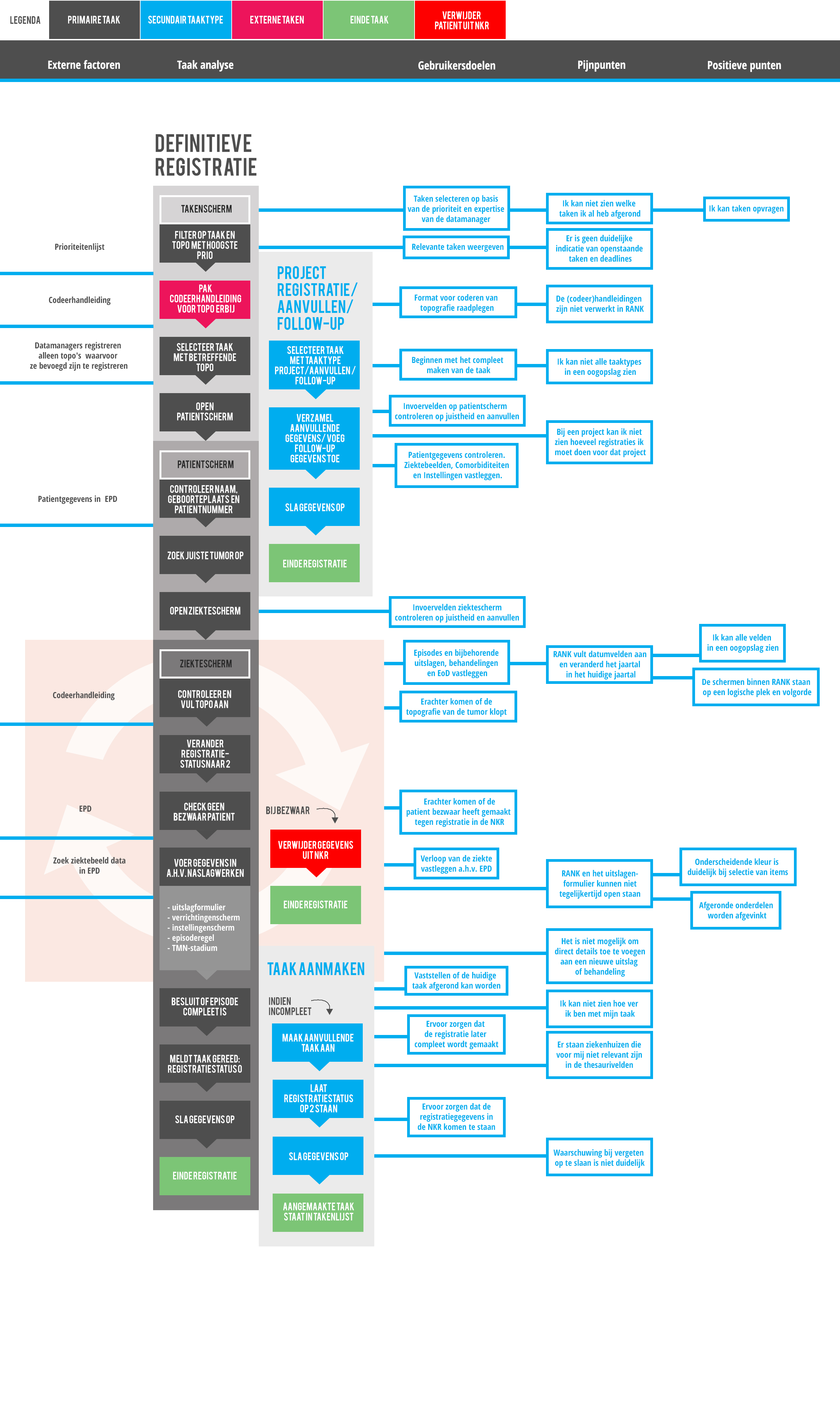
I planned observation sessions with 4 datamanagers. The aim of the observationsession was to obtain a better understanding of the user's frustrations with RANK. To help grasp how the datamanagers work with RANK, what their tasks are within RANK and to discover pain points at certain steps in their workflow, I did a task analysis. I observed the datamanagers and noted each task they performed within RANK and divided the tasks into smaller steps. After the taskflow became clear, I asked the datamanagers for feedback to validate it. at a later stage in the project I added user goals, pain points and positive points to the steps in the task flow at which they occured.
Functional Mockups
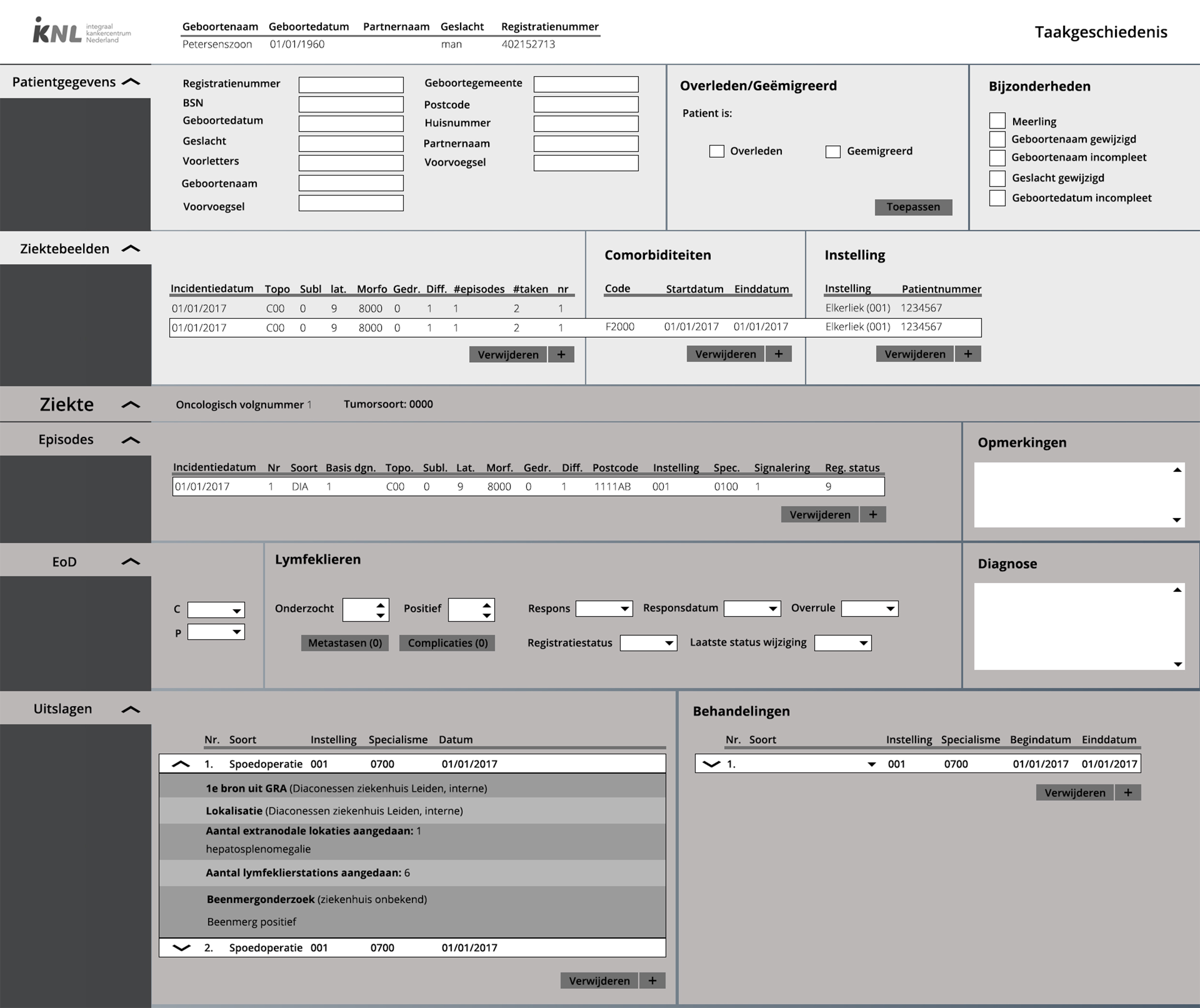
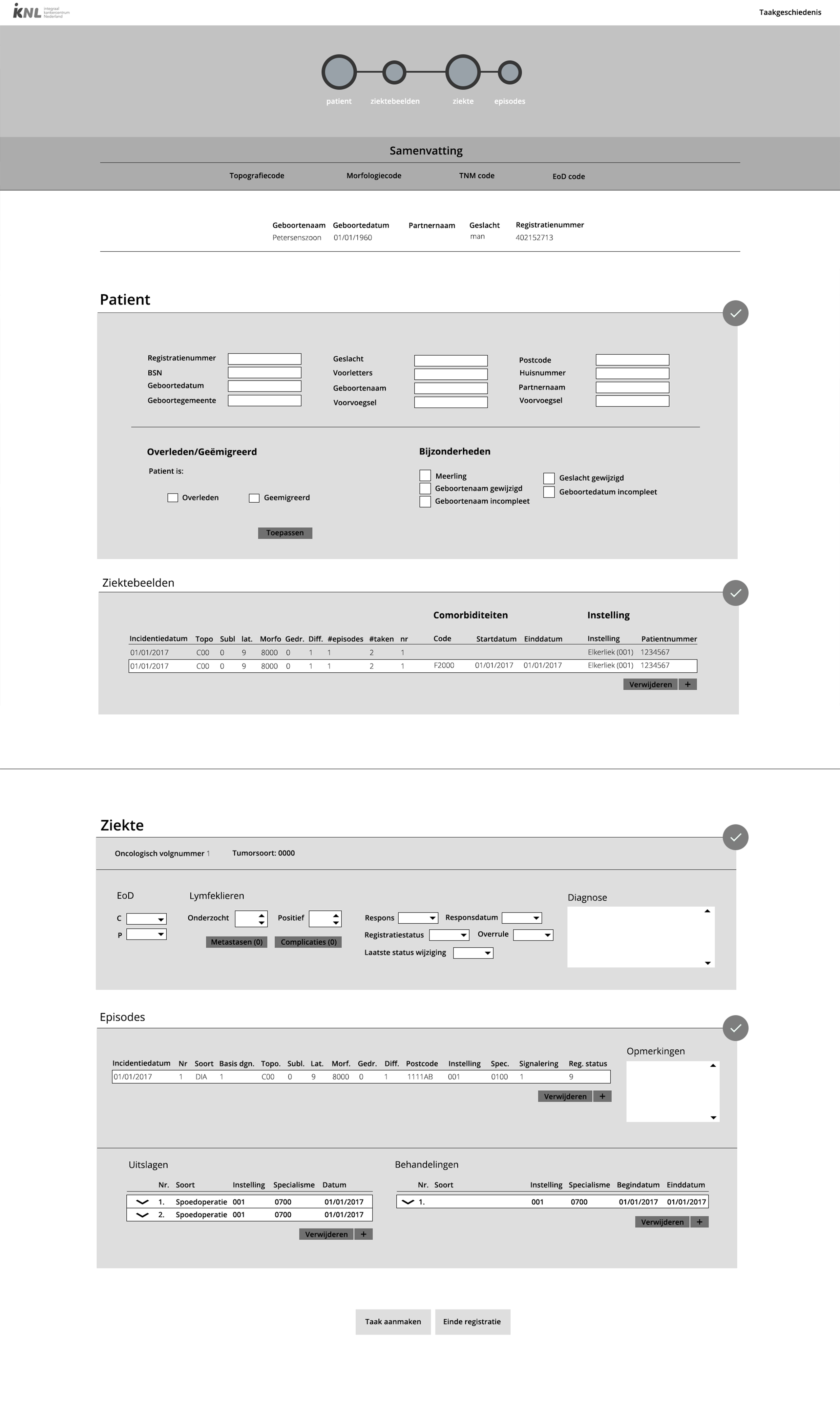
After the observation sessions I had found the frustrations the datamanagers had with RANK. After prioritizing, listing them in order of frequency and grouping them I was left with two fields of improvement: Clarity and Efficiency. I made two mockups, turned them into interactive prototypes in invision and subjected them to usertests with the 4 datamanagers I observed before. To find how intuitive the mockups were, I defined scenarios for the datamanagers to follow and asked them to think aloud whilst perfoming the scenarios so I could take note of any elements in the mockups that were not clear
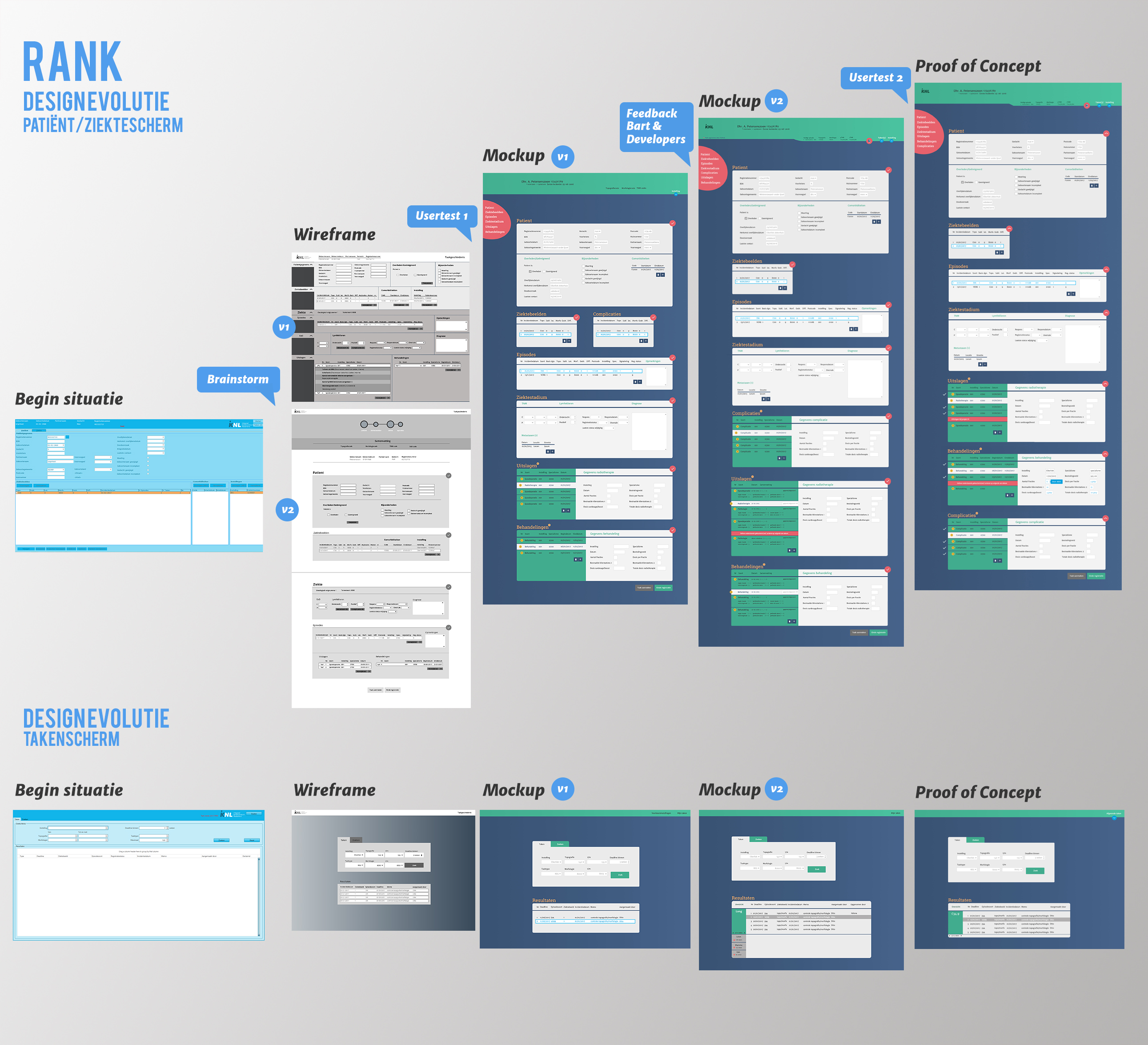
Designevolution RANK
After the first user test I combined the good aspects of both mockups and added colour to better contrast and scannability of RANK. The design evolution below gives a broad overview of the steps taken and the outcome of each design iteration.
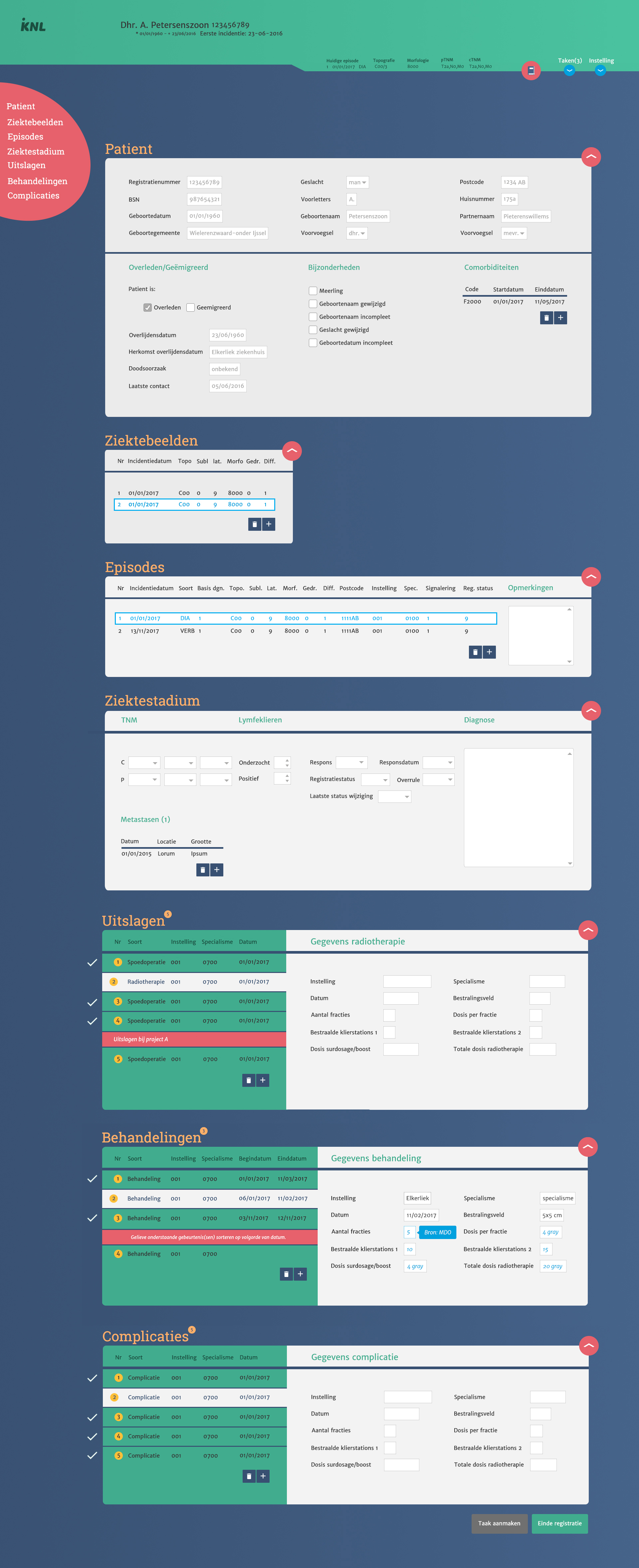
The improved version of RANK
The image below shows the final iteration (after the second user test).
Biggest improvements
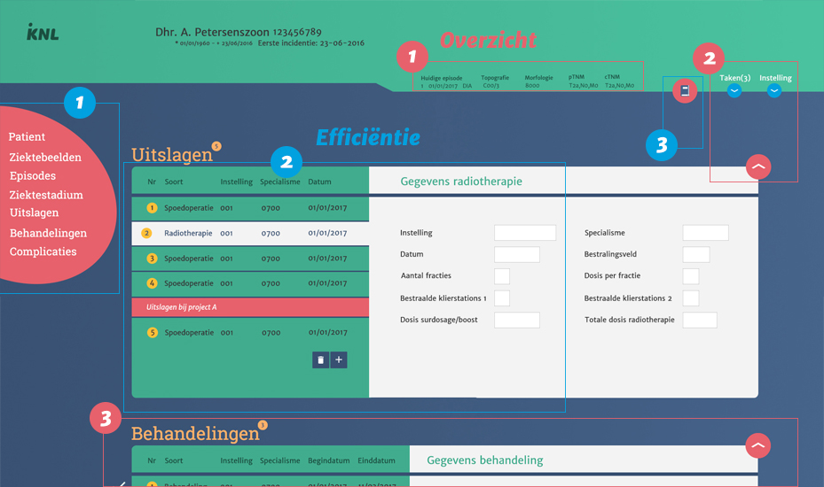
The image below shows the biggest improvements opposed to the old version of RANK. The biggest improvements in Clarity (in red) are:
1. An overview of important patientdata.
2. Accent colours make for better scannability of the application
3. The different tasks within RANK are divided into blocks, folowing the gestalt principle of proximity, which states that "objects or shapes that are close to one another appear to form groups" this further contributes to the overall scannability of the application.
The biggest improvements in Efficiency (in blue) are:
1. A sidenav which instantly takes the user to his desired task.
2. Datamanagers are able to edit or view the details of patient results and treatments with a single mouseclick.
3. Datamanagers can access classification manuals and general manuals from within RANK. This makes for better version control as each datamanager has the same version of the documents to work with.
